Design: ‘Music Notes: A Spotify Redesign Project’
A redesign and new user experience for Spotify

May 2023
Role: Designer, Developer
Project Overview
About Spotify
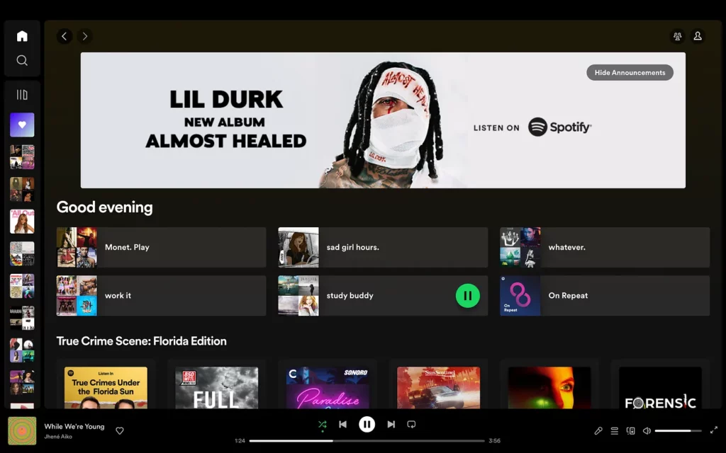
Launching in 2008, Spotify holds the title of being the world’s most popular music streaming service with 515 million users. According to the service, it features over 100 million tracks, five million podcast titles, audiobooks, and live events to a user’s nearest location. Spotify gives its users the option of a free service with ads, or they can upgrade to Spotify Premium — which gives access to exclusive features that include improved sound quality and music that is “on-demand, offline, and ad-free.”
Music to My Ears
Music has played a huge role in my life for as long as I can remember. It calms me down during my most stressful moments and adds something extra to my daily routines.
From listening to my “study buddy” playlist as I do schoolwork to my “roll my windows down and cruise” playlist when I drive my car, my favorite songs serve as the soundtrack of my life.
As a loyal Spotify Premium user for almost 10 years, I thought it would be interesting to redesign the service I use every day. While there is so much the service currently offers, I wanted to make a few improvements and to develop new features that can help the company generate new users.
Problem
Spotify currently has a feature where users can view the lyrics to their favorite songs by either swiping up on the song artwork when in the app view or clicking a tiny microphone icon in the bottom right corner of the desktop view. However, this can be difficult to notice, as I alone, just discovered the desktop feature not too long ago.
Users can also connect with other users by using the search function, but it can be difficult to find friends and new connections. Each Spotify profile looks similar and lacks the option for personalization.
Solution
Changes
The location of the lyrics feature (desktop) affects the experience of the user because many may not be aware that it exists. The user may stumble on the location when using the app — due to an accidental swipe up — but only when the song artwork is maximized on the screen.
By moving the feature closer to the song that’s currently playing with an icon and label combination, more users can be aware of the feature.
As a way to improve the user experience, I wanted to provide the option to view the corresponding music video for a selected song. This feature will look similar to the lyrics feature, as it will have an icon and label combination near the current song title. When the user clicks (or taps) on the feature, the screen will move to a new screen, displaying the music video.
Another way to improve the experience of the user is to include a community chat room feature (similar to Facebook and Twitter) that allows users to share their interests and recommendations. Users can have an existing “timeline” that updates with statuses from other users, as well as, direct messaging.
The concept of “Spotify Connect” will ease the frustration of searching for friends within the service. This separate search page highlights a user’s current friends list and also offers recommended users who share the same interests. With the addition of user QR codes, it’ll be easier connecting with others.
With the improvement of user interaction, I would also give them the option of profile personalization that allows them to customize their Spotify profiles. Users can choose to add Spotify “stories” (think Instagram and Facebook), music interests, public playlists, social media links, background photos/wallpapers, etc. to their page to promote creativity and personality.
My Process
When brainstorming for this project, I had to think, “What would I want to see from this service as a user? How do I make subtle, yet useful, changes that can benefit new and existing users?”
Consumers enjoy new and exciting experiences that they can’t necessarily receive from other services. They especially like when the needs they have can all be met by one service. I needed to develop a way for my ideas to work without users having to leave the service (or app).
From creating user personas to researching other music streaming services and social media platforms to, simply, using Spotify while developing this project, I had to think from both a designer and user perspective.
Customer Journey Maps
Persona 1 — Erykah Brooks
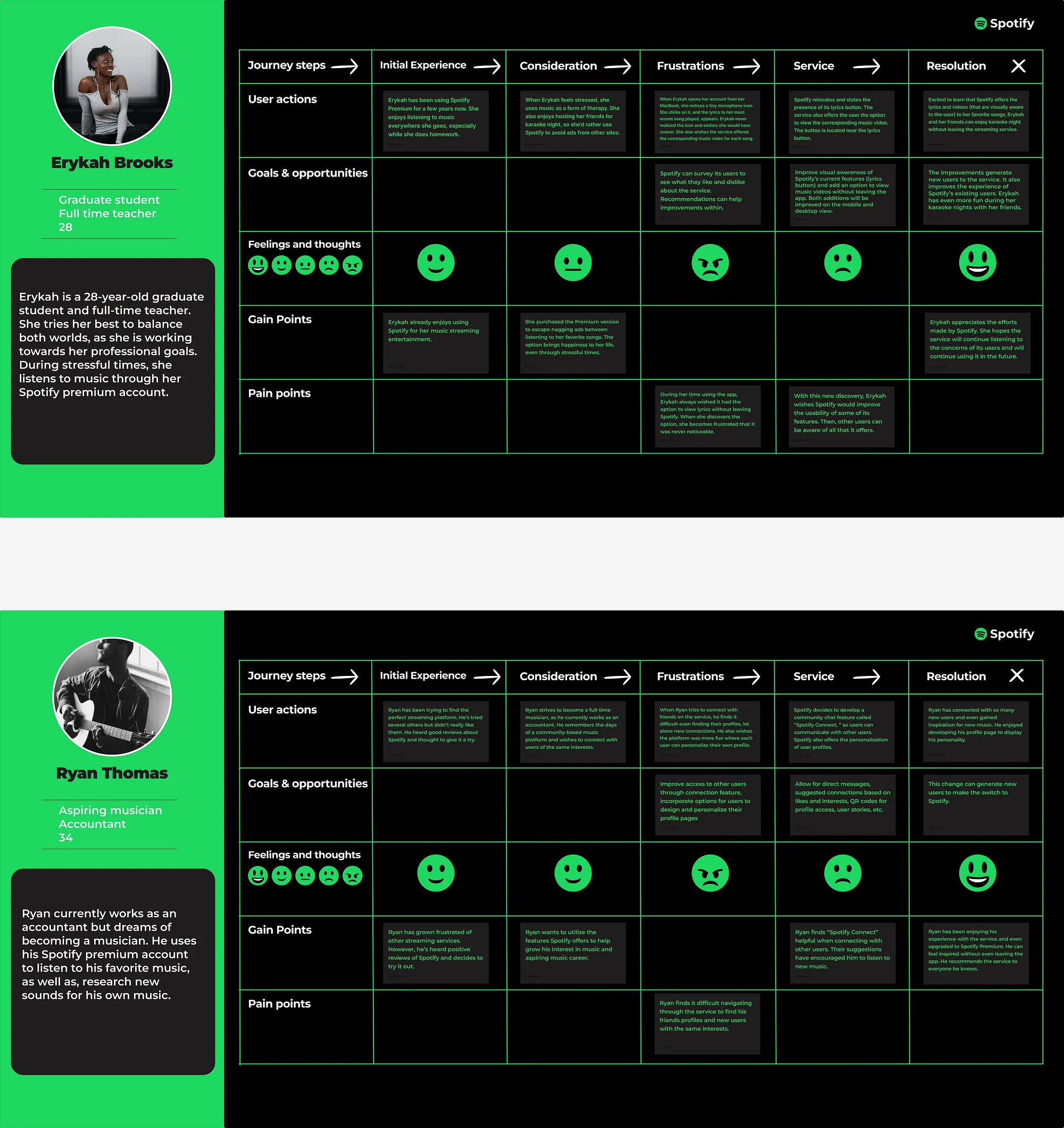
Erykah is a Spotify Premium member who uses the service as a form of therapy. She enjoys hosting karaoke night to destress from school and work. She always wished Spotify had the option of viewing the lyrics as her and her friends sang their favorite songs — instead of viewing elsewhere. One karaoke night, she notices a microphone icon in the righthand side of her desktop view. When she clicks on the icon, the lyrics appear. Erykah becomes frustrated because if she had known, she would have utilized the feature every time.
If the service relocated the icon and added a label, Erykah would have been aware of the feature. Although she enjoys using the service, she wishes Spotify would consider the usability of its features that are offered.
Persona 2 — Ryan Thomas
By day, Ryan works as an accountant, but he’s always wished for more. As an aspiring musician, Ryan searches for connections who have similar musical interests and inspiration for his own music. Ryan is a new Spotify user, as he’s tried other music streaming services but didn’t like them much.
Ryan remembers the days of platforms like MySpace where users can interact with each other and display their interests with other users. When he starts using Spotify more, he finds it difficult to connect with others and dislikes the layout of its personal profiles because it lacks creativity.
How can these changes improve each user’s experience? You can view my journey maps here.
Prototypes

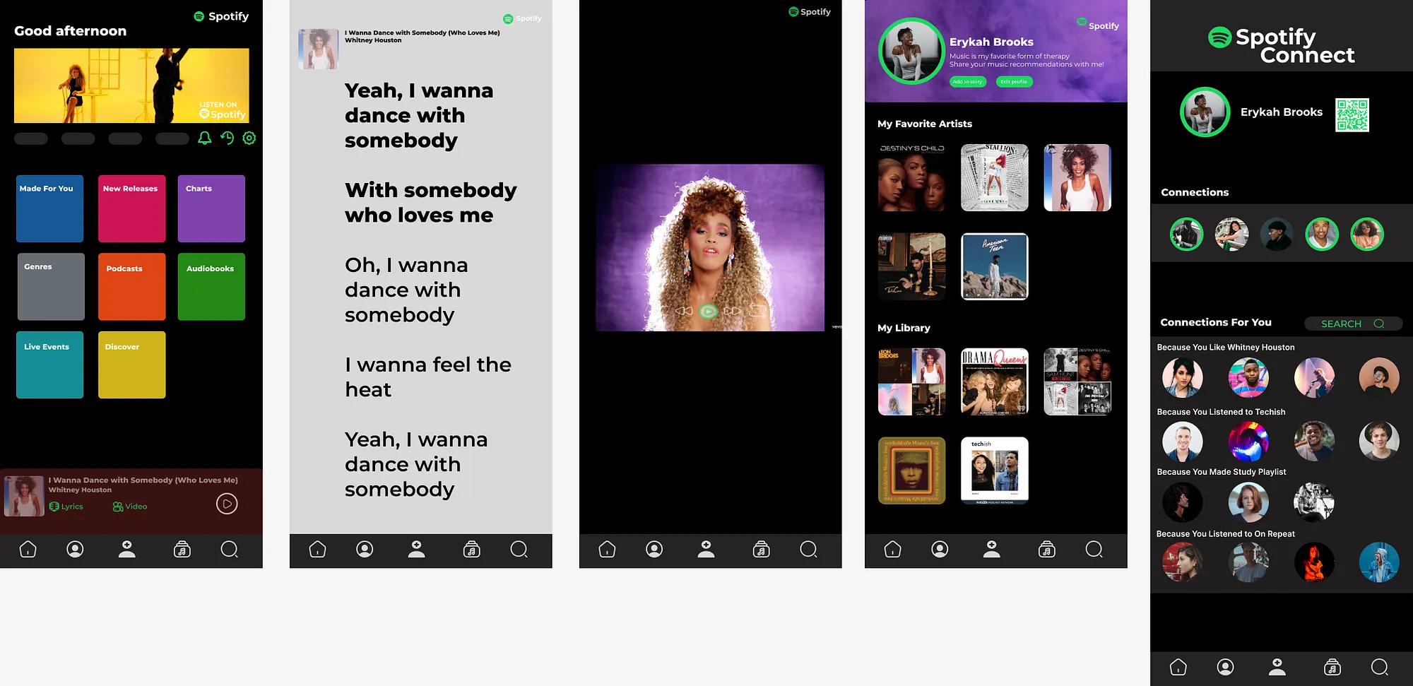
Developing the prototypes for each view was my absolute favorite part of this project. I wanted to keep the same design aspects that Spotify currently offers, such as color palette, font and layout but to subtly incorporate my ideas.
My desktop view (top, above) displays the homepage, lyrics view, music video view, profile page and “Spotify Connect.” The app view (below, above) displays the same pages but from a different device.
For the layout, I knew I had to be conscious of the differing screen sizes when placing certain pieces of content. As I mentioned earlier, I mimicked the layout that Spotify currently has.
With the profile page and “Spotify Connect,” I used inspiration from other social media services, like Facebook and Instagram, to develop an easy-to-use feature.
You can view my prototype here.
Results
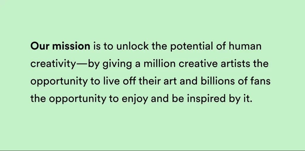
In conclusion, users around the world enjoy the service Spotify has to offer. It allows them to listen on the go or even when they have nowhere to go. Spotify cares about its users and makes it their mission to encourage human creativity. The service can maintain its current users and generate new users by implementing new features and design choices that improve the overall user experience.
Final Deliverables
Journey Map: https://www.figma.com/file/hXZa74cgvKonC4EOKY6OWi/7010e-User-Journey-Map?type=design&node-id=0-1&t=XzL0dEep5YiyOpa7-0
Prototype: https://www.figma.com/file/20l9mHMSzPKQOq448dBHJo/7010e-Prototype?type=design&node-id=0%3A1&t=61wkfjbwpoCGdYeZ-1
Presentation: https://www.youtube.com/watch?v=dF9VemqZ_xg
Presentation Slides: https://www.canva.com/design/DAFkyzrXe8g/bSq-s9ohKIKjewjZ58Xj3Q/edit?utm_content=DAFkyzrXe8g&utm_campaign=designshare&utm_medium=link2&utm_source=sharebutton