An app that helps users and readers interact with a magazine publication.
The following project was for Native App Development (NMIX 6030) within The University of Georgia’s New Media Institute. This case study can also be found on medium.com where I host my case studies for this Master’s program.
Fall 2022
Role: Developer, Designer
Project Overview
For my final project, I decided to revisit the idea I had for my midterm project. During my undergraduate years of college at The University of Alabama, I found my love for writing and editing magazine publication when the University created the campus magazine, Alice.
Since then, a goal of mine has been to create my own magazine publication. With the teachings in this program, I thought it would be interesting to make that goal a reality.
Thus, Monet. was born. While I was proud of my midterm final product, I believed there were so many parts that I could improve and make for the best user experience. I changed the overall layout, made new design choices, and added new features that I learned from this very Native App Development course, along with features I researched.
Challenges
While choosing a color scheme and supporting visuals were easy decisions to make, choosing a layout and incorporating user interaction was more difficult. I was not a huge fan of the original nav bar from my midterm project. It was more compact, didn’t have space for the longer names of magazine content, and the design was not appealing to the eye. I tried to redo the concept and design changes to make it work, however, I was not impressed with that decision. I researched different ideas, but none of them felt right.
I also faced the challenge of incorporating user interaction concepts while also staying with the goal of the publication. For me to make that decision, I had to act as if I was a potential “customer” using the Monet. app for the first time. So, I scoured the internet, got inspiration from popular magazine publications, and flipped through the pages of the “Mastering SwiftUI 4” book.
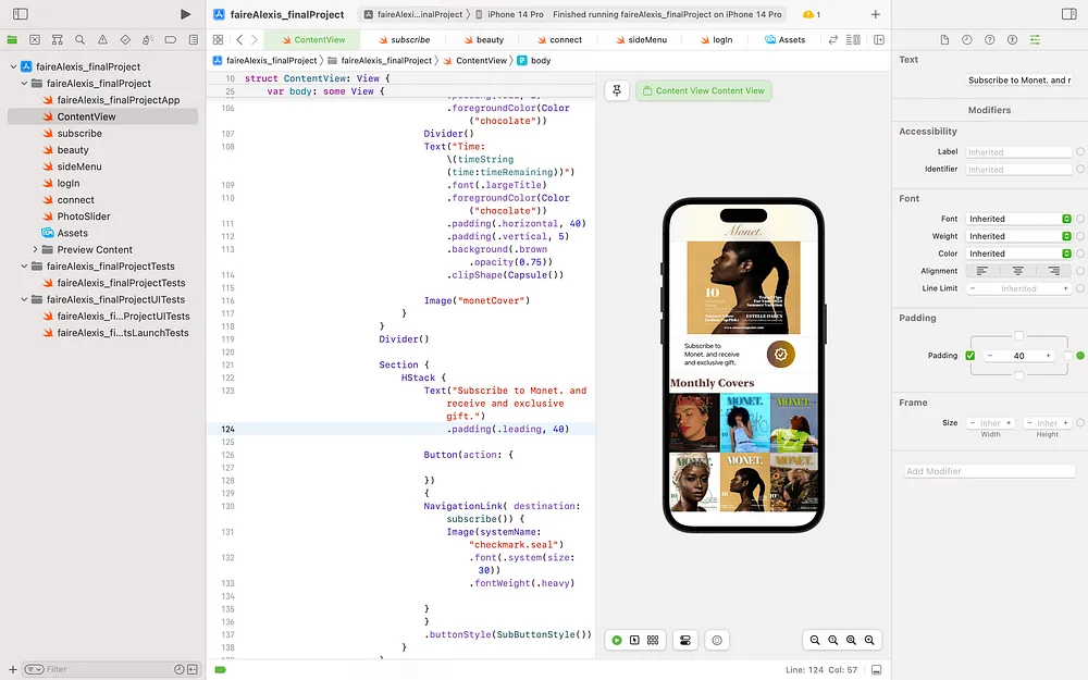
After making my final decisions, I decided to add a timer that counts down until the next monthly magazine, a button that leads to a payment plan for subscriptions and a button that allows the user to sign into their account on the app.
Solutions
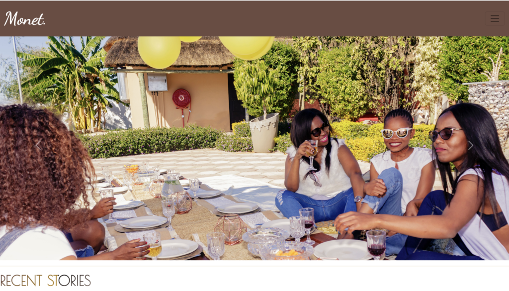
To solve the challenge of the nav bar menu, I created a hamburger menu icon that leads to a new swift view when clicked. Once the user clicks on the icon, a list of section names for the magazine content is displayed that can lead to new pages of content. On this menu, the user also has the option of signing into his or her Monet. account or creating one. The “Sign In” button leads to a new page that has a sign in form where users can type into the text fields.
Back on the homepage, as the user continues the scroll, a timer for the next magazine is counting down — using hours, minutes, and seconds. This engages the user and informs of upcoming news. Underneath the visual of the upcoming magazine, is a section of content that entices the user to purchase a subscription to the magazine and a button that leads to a page with information about the subscriptions. I thought this was a good tactic to grab the attention of the user.
Results
Having the opportunity to make adjustments to this project was a great one. While at times it was indeed challenging, I was encouraged to think outside of the box and to truly push myself to make something great. In the future, I wish to continue to add more to this app. I want to eventually discover how to add a chat or pop-up chat feature where users can interact with editors, photographers, writers, etc. of the publication. I think it would also be interesting to see a comment section for the articles posted and a simpler way to display the articles.
The final video presentation of the “Monet. App Project.”